Today, I’d like to share a small text effect with you. It’s inspired by an effect visible on the Academy website, featuring a number that appears to be broken into segments or sliced up, pulled apart, and then brought back together. This effect seems to be an animation created with Lottie, utilizing clip-path animations on SVG paths.
I wanted to experiment and see if I could achieve a similar effect using plain HTML text without employing any clip paths. Instead, I used elements with their overflow set to hidden. While the result is not an exact match, it’s a playful typography effect that can introduce some interesting scroll action to a design.
Here’s a screenshot of how the effect looks, using a grid based layout where we repeat the text as many times as we have columns:
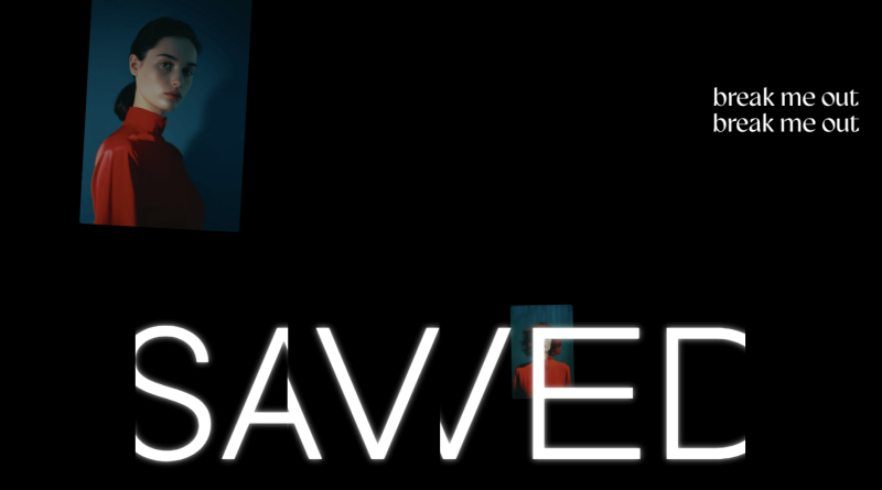
Now, we can play with translations:
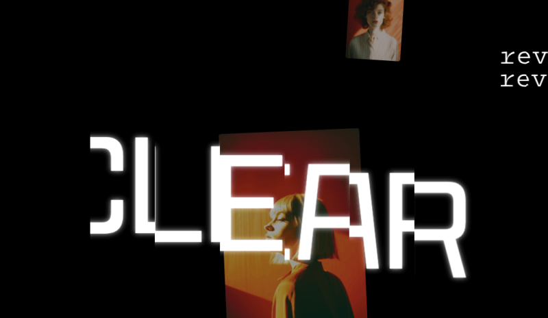
…or creating a different look by pulling the cells wider apart:
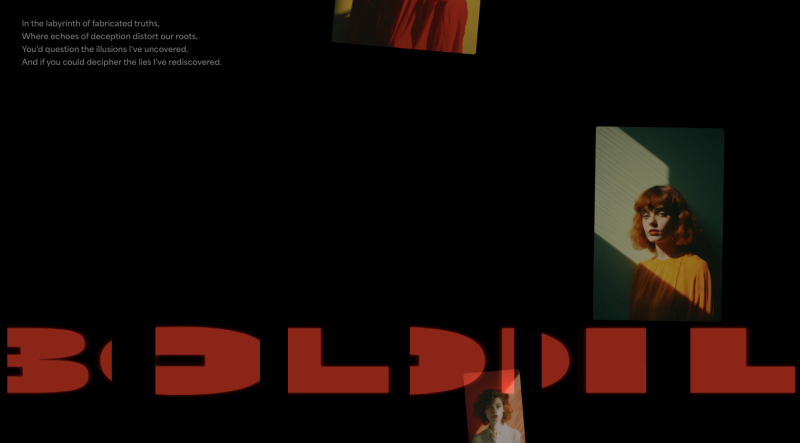
Or, moving in from only one side:
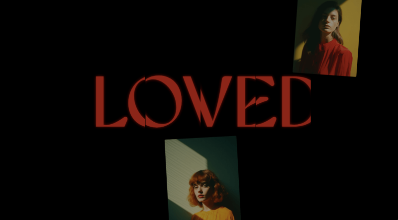
It’s kind of hard to see this in static images so let’s have a look at it in motion:
All this reminds me a bit of glass and mirrors… There’s lots of possibilities here to make a ton of unique effects, especially when you start think of rows instead of columns, or indeed flipping segments to appear mirrored, i.e. using something like transform: scale(-1,1) 🤔
Hope you enjoy this and find it inspiring!
If you want to support my work and get bi-weekly frontend news plus inspiration right in your inbox, I’d love to invite you to subscribe to our newsletter, the Collective!

