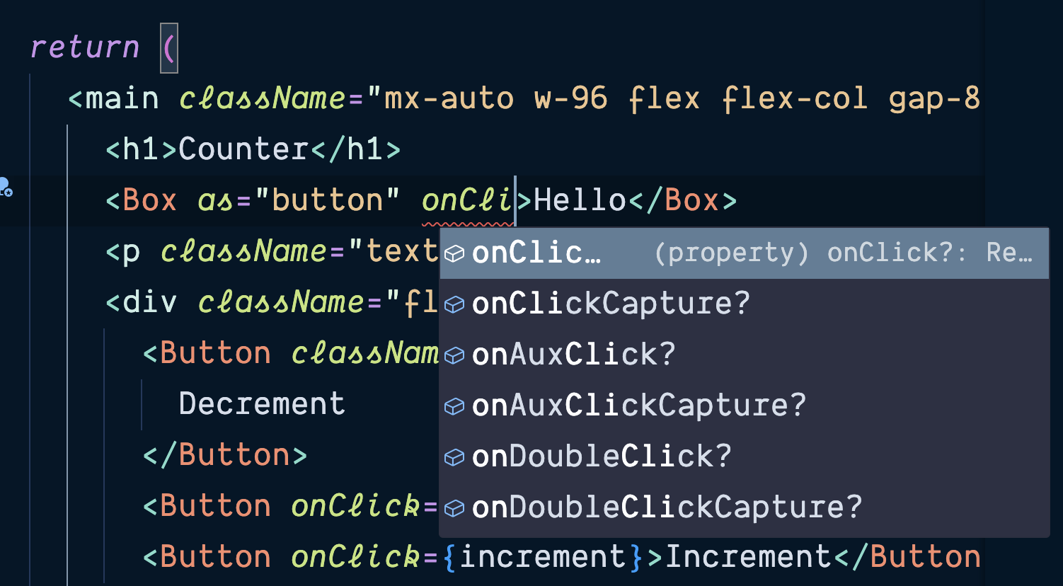
In this quick tip, excerpted from Unleashing the Power of TypeScript, Steve shows you how to use polymorphic components in TypeScript.
In my article Extending the Properties of an HTML Element in TypeScript, I told you that, over the course of building out a large application, I tend to end up making a few wrappers around components. Box is a primitive wrapper around the basic block elements in HTML (such as <div>, <aside>, <section>, <article>, <main>, <head>, and so on). But just as we don’t want to lose all the semantic meaning we get from these tags, we also don’t need multiple variations of Box that are all basically the same. What we’d like to do is use Box but also be able to specify what it ought to be under the hood. A polymorphic component is a single adaptable component that can represent different semantic HTML elements, with TypeScript automatically adjusting to these changes.
Here’s an overly simplified take on a Box element inspired by Styled Components.
And here’s an example of a Box component from Paste, Twilio’s design system:
<Box as=”article” backgroundColor=”colorBackgroundBody” padding=”space60″>
Parent box on the hill side
<Box
backgroundColor=”colorBackgroundSuccessWeakest”
display=”inline-block”
padding=”space40″
>
nested box 1 made out of ticky tacky
</Box>
</Box>
Here’s a simple implementation that doesn’t have any pass through any of the props, like we did with Button and LabelledInputProps above:
import { PropsWithChildren } from ‘react’;
type BoxProps = PropsWithChildren<{
as: ‘div’ | ‘section’ | ‘article’ | ‘p’;
}>;
const Box = ({ as, children }: BoxProps) => {
const TagName = as || ‘div’;
return <TagName>{children}</TagName>;
};
export default Box;
We refine as to TagName, which is a valid component name in JSX. That works as far a React is concerned, but we also want to get TypeScript to adapt accordingly to the element we’re defining in the as prop:
import { ComponentProps } from ‘react’;
type BoxProps = ComponentProps<'div'> & {
as: ‘div’ | ‘section’ | ‘article’ | ‘p’;
};
const Box = ({ as, children }: BoxProps) => {
const TagName = as || ‘div’;
return <TagName>{children}</TagName>;
};
export default Box;
I honestly don’t even know if elements like <section> have any properties that a <div> doesn’t. While I’m sure I could look it up, none of us feel good about this implementation.
But what’s that ‘div’ being passed in there and how does it work? If we look at the type definition for ComponentPropsWithRef, we see the following:
type ComponentPropsWithRef & RefAttributes We can ignore all of those ternaries. We’re interested in ElementType right now: type BoxProps = ComponentPropsWithRef<'div'> & { Okay, that’s interesting, but what if we wanted the type argument we give to ComponentProps to be the same as … as? We could try something like this: import { ComponentProps, ElementType } from ‘react’; type BoxProps const Box = export default Box; Now, a Box component will adapt to whatever element type we pass in with the as prop. We can now use our Box component wherever we might otherwise use a <div>: <Box as=”section” className=”flex place-content-between w-full”> You can see the final result on the polymorphic branch of the GitHub repo for this tutorial. This article is excerpted from Unleashing the Power of TypeScript, available on SitePoint Premium and from ebook retailers.
props: infer P,
) => Component
? PropsWithoutRef
: PropsWithRef
as: ElementType;
};
as?: E;
};
const TagName = as || ‘div’;
return <TagName {…props} />;
};
<Button className=”button” onClick={decrement}>
Decrement
</Button>
<Button onClick={reset}>Reset</Button>
<Button onClick={increment}>Increment</Button>
</Box>


![Where to Watch Frasier Reboot in 2023 [StreamFrom Anywhere]](https://www.cloudwards.net/wp-content/uploads/2023/10/Where-to-Watch-Frasier.png)


